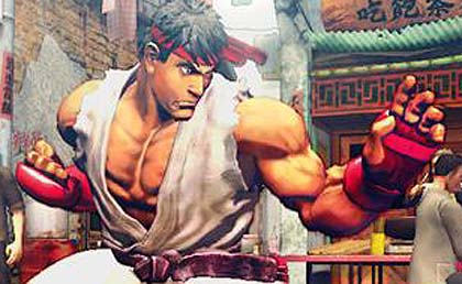
Okay, i guess we all have seen the video, and saw our beloved fighters taking it on each other 3d style (2.5d ?) and in my opinion they look AWESOME! Ono is really taking the franchise towards the right direction although i do have some grips on some of the characters design.
Although the game looks 3d it feels like a classic 2d fighter, which is really awesome, the fast paced combat, the projectiles, the combos, it is really our beloved street fighter coming back to us in all its glory.
The China stage does look gorgeous although the background characters do not move much, but thats pretty normal seeing how far we are from the release of the beast.
I was a bit skeptical about the ultras thing but the video reassured me. The way the camera moves during the ultra is really well done and takes the fight to another level. Anybody noticed ryu's expression when he was about to finish his ultra with a hadoken? it really reminds me of his hadoken against sagat from the street fighter 2 animated movie.
My only grips so far is Ryu's mouth when he took that dragon punch to the chest, his mouth was a bit toooo wide opened :S, he kinda look like a character from planets of the apes. I also think ken's hair looks more like a helmet than hair. But really, those two things can be fixed in a matter of 24 hours really, i hope they will listen to fans as most of us fans, from what ive seen from different forums, arent too keen about the over done facial expressions.
All in all im very pleased with what i saw today (except having to look at the 1up guys discussing something they apparently dont understand, comparing SF to soul calibur?!?!?!?)
Anyway, im really looking forward to this game, and today's footage proved to me that the project is in good hands.
So what abt you guys? Let me know what you think in the comments section
Shooryureppa
.png)


4 comments:
game looks like moving shit bro, the design is crap, too many colors, feels like a fucking circus.
game looks like moving shit bro, the design is crap, too many colors, feels like a fucking circus.
I gotta disagree with you on that. The gameplay is just gorgeous i was really amazed how 2d the game feels. I do agree that some of the design looks out of place but if the game is only 2% then i guess we can rest assured that things will improve.
I was disappointed w/ gameplay in that what seemed to be the Ultras, didnt seem much cooler or different at all.
The look or Ryu and can I just know theyre gunna fix them. They cant be as blind as we think they are.
Post a Comment